
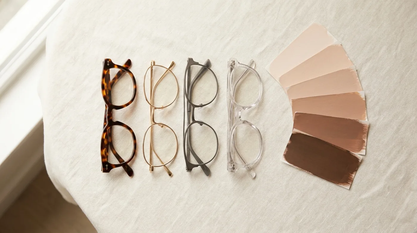
What color glasses suit my skin tone?
The frame colors that suit your skin tone are the ones that match your undertone in hue and differ from your skin in lightness: warm undertones suit tortoise, amber, gold and warm brown; cool undertones suit black, silver, navy and gray; neutral undertones take both. In every case the frame needs to sit a few steps lighter or darker than your skin, or it disappears.
Color is the second decision, not the first. Shape controls proportion, so settle that first: measure your face shape, then work through the face shape guide or the shape-specific pages for round faces and square faces, before you argue about tortoise versus charcoal. The stakes are ordinary but constant: The Vision Council's Q3 2025 survey of 12,097 US adults found more than 80% use some form of vision correction, and 86% of eyewear purchases still happen in-store, under retail lighting that flatters the product rather than your face.
How do I find my skin undertone at home?
Find your skin undertone with three cross-checks, and trust the result only when at least two of the three agree. Run all three in indirect daylight next to a window, never under indoor LED or store lighting, which shifts apparent warmth before you have judged anything.
- Veins. Green or olive veins on the inner wrist point warm; blue or purple point cool; a mix points neutral.
- Jewelry. Hold gold and silver against the inner forearm. Whichever makes the skin look healthier rather than sallow wins: gold means warm, silver means cool, both working equally means neutral.
- Sun. Skin that tans readily and rarely burns is warm or neutral; skin that burns and then goes pink is cool.
A fourth check settles ties: hold a plain white sheet of paper under your chin. A yellow cast against the white reads warm, a pink or blue cast reads cool.
Is the vein test for undertone actually reliable?
The vein test is a weak signal, not a measurement: published skin-optics work shows the apparent color of a vein is set by how deep and how wide the vessel is, by blood oxygenation, and by how skin scatters light, not by your undertone. Kienle and colleagues, writing in Applied Optics in 1996, list exactly four determinants: wavelength-dependent scattering and absorption in skin, blood oxygenation state, vessel diameter and depth, and visual perception.
A phantom study of blood-vessel appearance puts numbers on the depth term. A vessel at 1.0 mm shows the characteristic blue everyone associates with a subcutaneous vein; at 0.5 mm it reads darker and more bluish; at 1.5 to 2.0 mm it becomes nearly indistinguishable from the surrounding tissue whatever its oxygenation state.
The practical consequence is blunt. Thin skin over a shallow vein reads "cool" on a person whose skin is warm, and on deeper skin tones the veins are often invisible, so the test returns nothing at all. That is why the section above says two of three, and why the closing section says verify on your own face rather than on a chart.
Why do glasses in your "right" color still look wrong?
Glasses in the right color look wrong when the frame is the same lightness as your skin: the hue can be perfectly warm or perfectly cool and the frame will still read as a smudge, because the eye separates a frame from a face by contrast in lightness before it registers hue at all.
Dermatology already quantifies skin lightness. The Individual Typology Angle is computed in CIELAB space as ITA = arctan((L* − 50) / b*) × 180 / π, and it bands skin into very light above 55°, light 41–55°, intermediate 28–41°, tan 10–28°, brown −30 to 10°, and dark below −30°. The same work identifies the two chromophores driving skin color: melanin, which contributes darker yellowish tones, and haemoglobin, which contributes redness. That pair is the physical basis of the warm-versus-cool distinction.
You do not need a colorimeter to use this. Pick a frame at least two bands away from your own. The classic failures are all one-band choices: nude or blush acetate on light-to-intermediate skin, mid-brown tortoise on tan skin, warm caramel on brown skin. Matte black on very light skin fails in the opposite direction, reading harsh rather than sharp because the contrast is at maximum.
What is the glasses color and skin tone chart?
The glasses color and skin tone chart below maps undertone against skin depth, a two-way grid rather than a single warm-cool list, and gives the frame colors, the materials and finishes that carry them, and the specific colors that fail for each combination. Find your undertone first, then your depth band, then read across.
| Your combination | Frame colors that work | Materials and finishes | Colors that fail | Why it fails |
|---|---|---|---|---|
| Warm + fair | Light tortoise, caramel, rose gold, olive | Glossy acetate, gold-tone metal | Jet black, nude, icy silver | Black is maximum contrast and shadows the eye; nude sits in the same lightness band |
| Warm + medium | Amber, honey tortoise, copper, brick red | Layered acetate, bronze, brushed brass | Mid-brown, camel, taupe | Matches skin lightness and disappears |
| Warm + deep | Gold, warm caramel, burnt orange, deep tortoise, cream | Thin gold and bronze metal, glossy acetate | Matte black, dark brown | No lightness contrast against the brown or dark ITA band |
| Cool + fair | Charcoal, slate blue, plum, silver | Stainless, titanium, glossy black acetate | Orange tortoise, mustard, camel | Warm hues push cool skin gray |
| Cool + medium | Navy, gunmetal, deep gray, berry | Titanium, gunmetal metal, matte acetate | Khaki, coral, warm gold | Clashes with the haemoglobin-driven pink cast |
| Cool + deep | Cobalt, emerald, deep violet, silver, gunmetal | Polished metal, saturated acetate | Dark tortoise, black, deep brown | Reads as an outline-less block against deep skin |
| Neutral, any depth | Taupe, charcoal, coffee, dark tortoise, crystal, both metals | Almost anything; finish decides | Translucent nude, mid-beige | Translucent acetate takes on the skin behind it and vanishes |
Treat the chart as a starting shortlist, not a verdict. The final section covers how to settle it on your own face.
What frame colors suit warm skin tones?
Warm skin tones suit frames in tortoiseshell, amber, honey, copper, warm brown, olive green, brick red and gold metal, colors that share the golden or peachy cast of the skin instead of fighting it.
Material matters as much as hue for warm skin tones. Tortoise, honey and amber are layered acetate effects that no metal can reproduce, so acetate is where warm colors live; the metal equivalents are gold-tone, bronze and brushed brass. Avoid stark silver, icy blue, pure white, cool gray and blue-black, all of which turn warm skin sallow. The one warm-skin trap is mid-tone honey acetate on tan skin: correct hue, identical lightness, and the classic disappearing frame.
What frame colors suit cool skin tones?
Cool skin tones suit frames in true black, charcoal, silver, gunmetal, navy, slate blue, plum and rose gold, colors with a blue or pink base that echo the pink or bluish cast in cool skin.
Cool colors read best in metal: stainless, silver-tone, gunmetal and titanium, plus high-gloss black acetate. Matte finishes flatten cool complexions slightly, so keep some gloss in the mix. Avoid orange-brown tortoise, mustard, khaki, camel, coral and warm gold, which make cool skin look gray or bruised. One exception contradicts the usual advice: cool-toned deep skin carries jewel colors such as emerald, sapphire and deep violet better than any other combination. "Cool means black" is the laziest sentence in this category.
What frame colors suit neutral undertones?
Neutral undertones suit almost any hue, which is why the decision for neutral skin shifts entirely to lightness contrast and finish rather than to warm versus cool. Neutral means the melanin-driven yellow and the haemoglobin-driven red are roughly balanced, so a mixed vein or jewelry result is a genuine reading, not a failed test.
Best bets: taupe, charcoal, coffee, beige, dark tortoise, clear crystal and both metals. The real risk for neutral undertones is that because everything works, people default to a safe mid-brown and land straight in the disappearing-frame trap. Pick a deliberate high contrast or a deliberate color instead of the middle.
What is the best frame color for pale skin?
The best frame colors for pale skin are mid-tone rather than extreme: warm pale skin suits light tortoise, soft caramel and rose gold, cool pale skin suits charcoal, slate blue, plum and silver, and both should treat jet black and translucent nude as the two colors most likely to go wrong.
Pale skin sits in the very light band above 55° ITA or the light band from 41 to 55°, which puts both failure modes at the same end of the ladder. Jet black is the maximum-contrast choice available there, so it dominates the face and casts a shadow across the upper cheek that reads as under-eye darkness. Nude, blush and clear acetate sit in the same band as the skin and vanish. One caveat the rest of the internet skips: pale skin with visible flush or rosacea should avoid pink, coral and red frames, which amplify the redness, and lean instead on green-based and cool-brown frames that neutralize it.
What frame colors look best on deep skin tones?
Deep skin tones look best in frames with real chromatic saturation: burnt orange, brick red, emerald, cobalt, deep plum, gold and warm caramel. Deep skin sits in the brown or dark ITA band, where black and dark tortoise flatten into the face and lose their outline.
The mechanism is worth stating rather than restating hues. Below roughly 10° ITA a dark frame no longer contrasts with the skin behind it, so the highest-impact move is up in lightness (gold, warm caramel, cream, tinted crystal) or up in saturation (emerald, cobalt, burnt orange), never down into black. Split by undertone: warm-deep skin takes gold, caramel, burnt orange and deep tortoise; cool-deep skin takes silver, cobalt, emerald, deep violet and gunmetal. Reviewing Frame's own try-on renders, the counterintuitive result is consistent: a thin gold wire frame reads bolder on deep skin than thick black acetate of the same frontal width, because the wire carries lightness contrast and the acetate carries none.
Does frame material change how a color looks on you?
Frame material changes the color more than most people expect: the same brown in glossy acetate, matte acetate and gold-plated metal produces three different results on the same face, because acetate is a solid layered color, metal reflects your surroundings, and translucent acetate takes on whatever skin sits behind it.
- Acetate is layered and opaque, and holds tortoise and honey patterns no metal can reproduce. Gloss adds contrast; matte lowers apparent lightness by roughly one step.
- Metal (stainless, monel, aluminum) is reflective and borrows the room's light, so it reads warmer under 2700 K indoor bulbs than in daylight.
- Titanium is naturally light gray and takes anodized color, but the same color reads cooler in titanium than in acetate.
- Translucent crystal acetate literally shows skin through it, so it lands in the wearer's own lightness band. It is the most common invisible-frame purchase there is.
One health constraint narrows the metal choices. Nickel is the most common contact allergen, with a pooled contact-allergy prevalence of 20.1% and nickel sensitivity of 17.5% in patch-tested populations, which is why gold-plated and cheap silver-tone frames irritate some wearers while titanium and stainless do not. Material also drives fit, which is a separate axis covered in the frame size guide — as is the pupillary distance your lens order needs.
Should frame color match your hair and eye color too?
Hair color is a stronger visual signal than eye color for frame choice, because hair sits directly against the frame's temples and brow line while the eyes sit behind the lens. Match the frame to your hair's warmth and let eye color decide only accent details. The ranking by visual weight runs hair, then undertone, then eyes, and it follows from physical adjacency rather than taste.
Warm brown or auburn hair pairs with tortoise, gold and olive. Ash blonde or black hair pairs with charcoal, silver and navy. Red hair pairs with dark tortoise, forest green, copper and dark blue. Gray and silver hair is the case people actually search for, and it changes the answer: gray hair shifts the whole face cooler regardless of the skin's original undertone, so someone who wore warm tortoise for twenty years should retest and will usually move to charcoal, silver, navy or soft plum. Eye color belongs on a thin inner rim or a temple detail, nothing larger.
How do you check a frame color on your own face before buying?
Check a frame color on your own face by seeing it rendered on your face in daylight-balanced light rather than by reading a chart. A virtual try-on on your phone puts the exact frame color against your exact skin in about ten seconds, which is the only test that accounts for undertone, skin depth and lighting at once.
One caveat competitors will not print: phone auto white balance shifts the apparent warmth of both skin and frame between shots. Compare candidate frames side by side in the same shot and the same light, near a window rather than under indoor bulbs. That matters because 86% of eyewear purchases still happen in-store, where the lighting is chosen to flatter merchandise, not to render skin honestly.
Frame's angle on this is narrow and useful: import any frame by URL, render it on your scanned face, then compare colorways of the identical shape back to back. Holding the shape constant isolates the color variable in a way no shop mirror can, because in a shop you are always changing two things at once. If you want the wider comparison first, see how to try on glasses online for free and how accurate virtual try-on actually is.

Scan your face

Import each colorway

Compare side by side
Shape first, color second. If you have not narrowed the shape yet, start with how to choose glasses by face shape. Frame's face scan returns the shape in about ten seconds, and color becomes a two-minute tiebreaker after that.
See every colorway on your face
Scan once. Import any frame. Compare colors side by side in seconds.
Download Frame for iOS